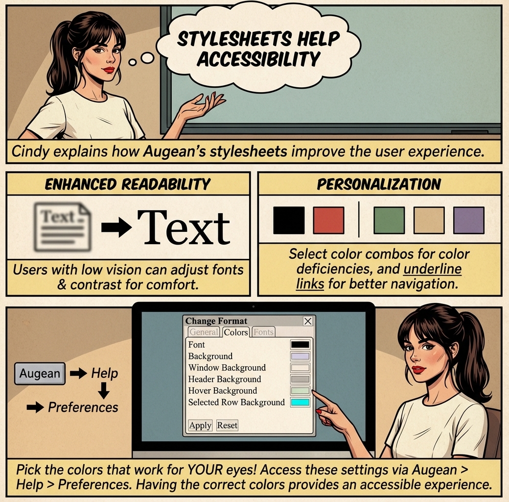
Enhanced Readability and Comfort
• Users with low vision can adjust font sizes, colors, and contrast to create a viewing experience that suits their needs, making content easier to read and reducing eye strain.
• For example, someone may switch to a high-contrast color scheme or enlarge text without breaking the layout, improving clarity and usability.
Personalization for Specific Needs
• People with color vision deficiencies can select color combinations that make content more distinguishable, ensuring that important information isn’t missed due to poor color contrast.
• Users can enforce underlining on links or add visible outlines to focused elements, making navigation more straightforward for those who rely on keyboard navigation or have difficulty distinguishing interactive elements.
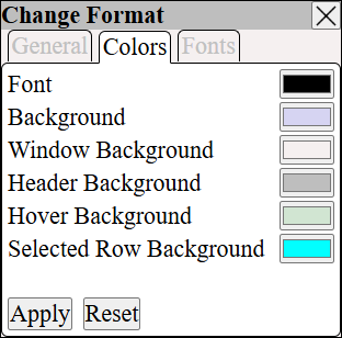
Pick the colors you need that work for your eyes.
Having the correct colors for you provides an accessible experience.
⟶ Help ⟶ Preferences